

Logo Design
Saint John Henry Newman Catholic School
The school recently adopted a new name to mark both its patron’s canonisation and its freshly rebuilt campus. They wanted a heraldic logo that felt rooted in tradition while still confident and contemporary. Below is a look into how the new logo took shape.
The Design Challenge
The brief drew inspiration from Cardinal Newman’s original coat of arms as well as the school’s existing logo. The goal was to create a crest that honoured these foundations but brought a new level of clarity, balance, and visual strength.

Old Logo

Cardinal Newman’s Coat of Arms


Concept Development
The first stage of the process was all about exploring possibilities. I produced a wide range of sketches, playing with different interpretations of shields, banners, hearts, flames, phoenixes, and other heraldic elements.
From these explorations, three clear directions emerged.
Refinement & Options
Traditional
This crest is inspired by key elements of the existing school logo, thoughtfully refined and paired with the banner from John Henry Newman’s own coat of arms. The cross-hatched detailing nods to classic engraved heraldry, giving it a timeless feel while still staying clean and contemporary.

Decorative
This concept leans into the more ornate side of heraldic tradition. The tassels and decorative flourishes extend beyond the shield. Inside the shield, symbolic elements from the school can be incorporated, with the phoenix standing proudly atop the crest as a unifying feature.

Modern
A modern interpretation of a heraldic emblem. It keeps the core symbols that matter most and distills them into a bold design. The motto is integrated directly into the shield’s border alongside the initials SJHN, creating a strong sense of unity. The phoenix sits at the centre as a clear, powerful focal point.
After presenting these options and discussing feedback from the school, we moved toward a final direction.

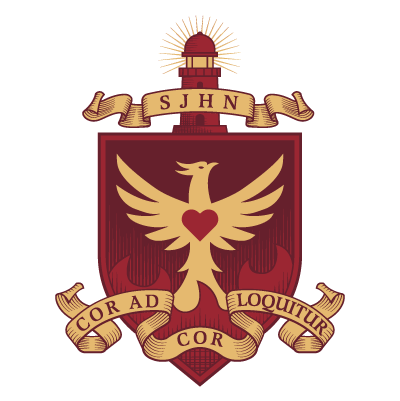
Final Logo
The structure of the shield, the posture of the phoenix, and the placement of the motto all create a design that feels confident, rooted, and respectful of tradition. The refined detailing and consistent proportions give the crest a unified, polished presence across all applications.
The result is an emblem that feels rooted, modern, and truly representative of the school’s character.


The completed identity brings together the school’s heritage, values, and renewed sense of purpose, ready to serve the next generation of Saint John Henry Newman students.

Lets connect!
If you have a project you’d like help with, or just want to say hi, I’d love to hear from you.
Made at The Media Collective.