
Logo & Mini Brand Guidelines
Primal Flower
Lollie got in touch to create a new logo and visual identity for Primal Flower, her gentle gardening business. Her practice focuses on thoughtful, hands-on plant care and she wanted her logo to reflect that. The brief was to create a mark that felt rooted in nature and craft.
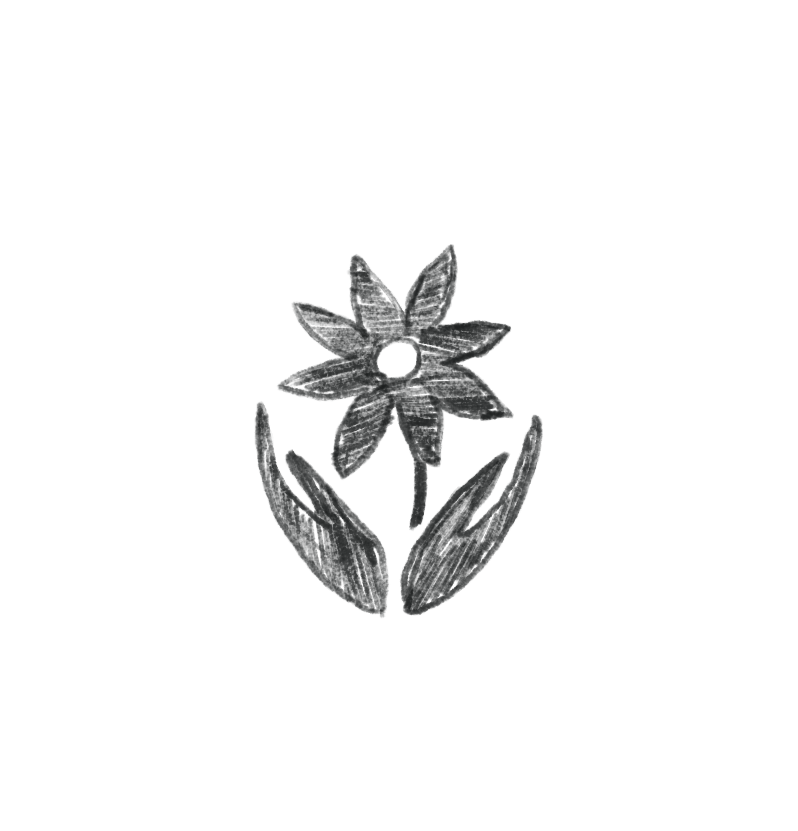
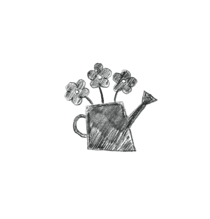
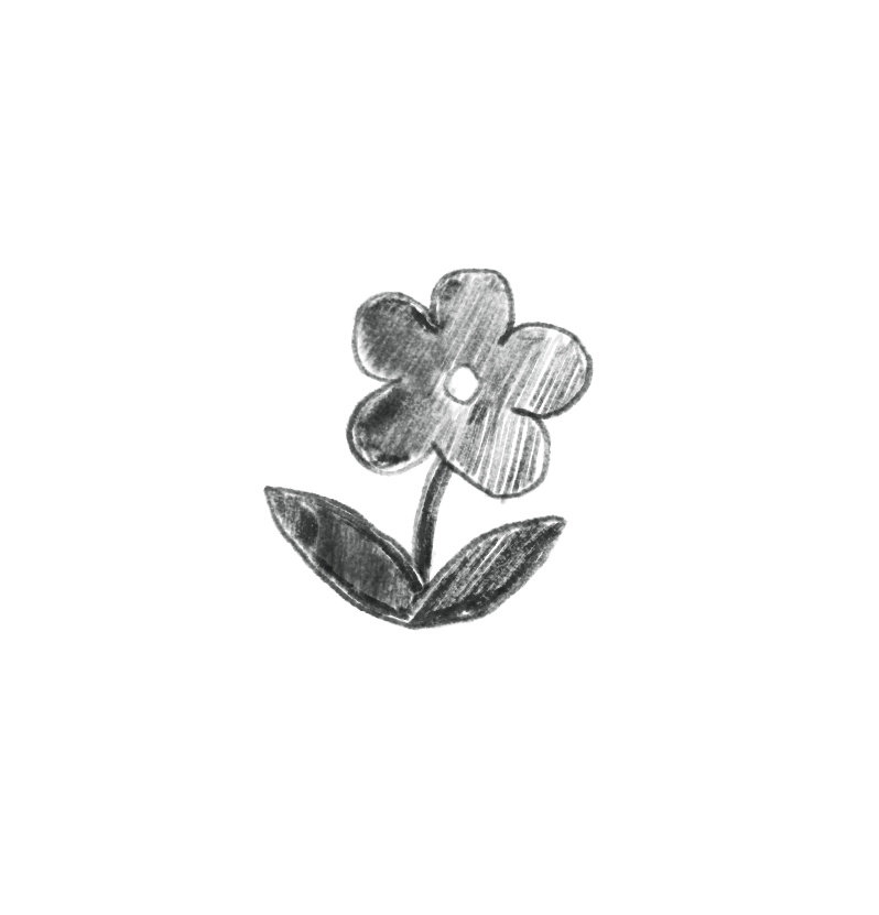
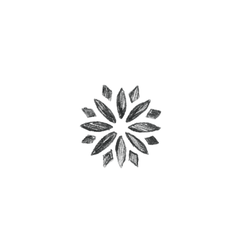
Concept Design
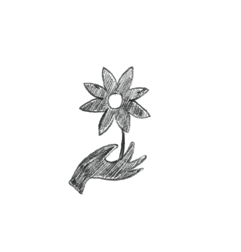
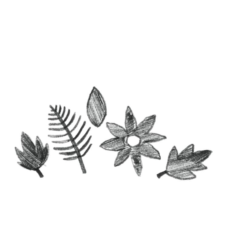
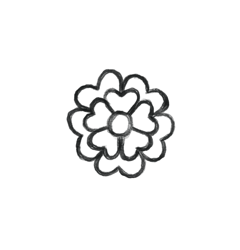
I began by sketching a bunch of logo directions that explored the flower theme with subtle references to hands and tools, and simplified plant and flower motifs. Each option pushed a slightly different balance between natural imperfection and professional structure, helping us define what Primal Flower should feel like visually before refining the final mark.
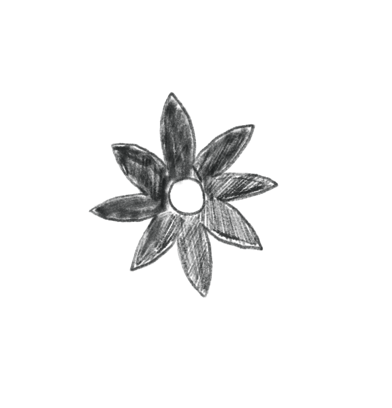
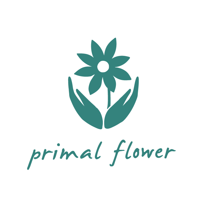
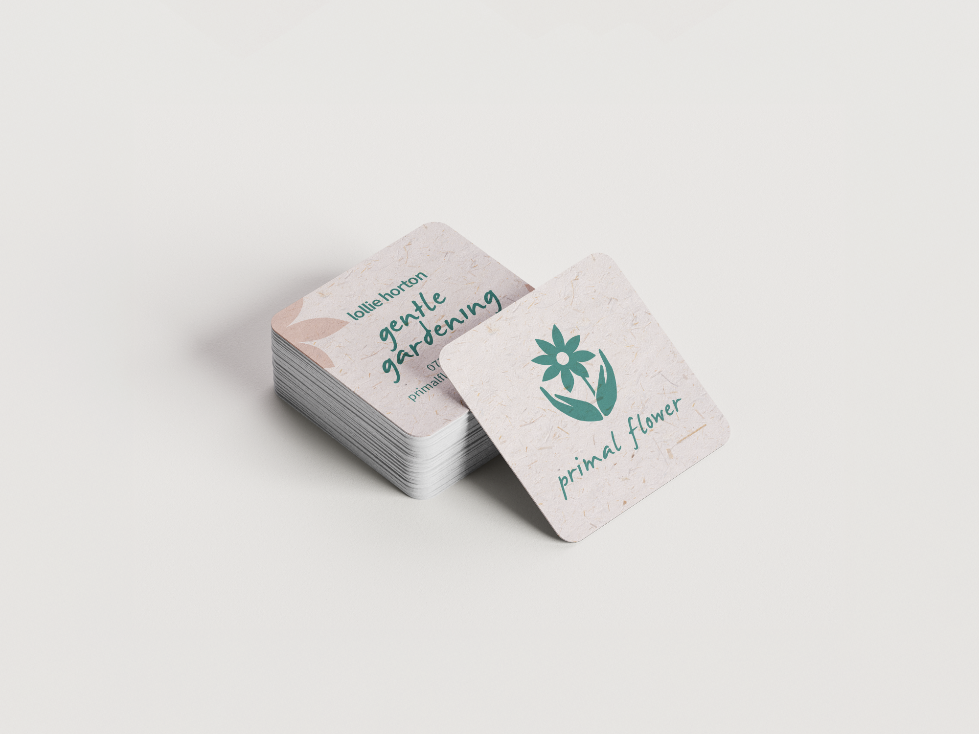
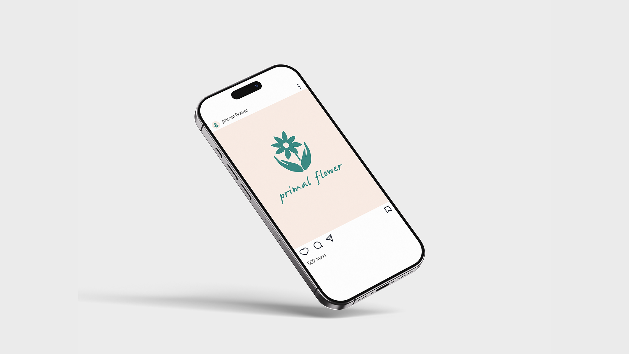
Final Logo
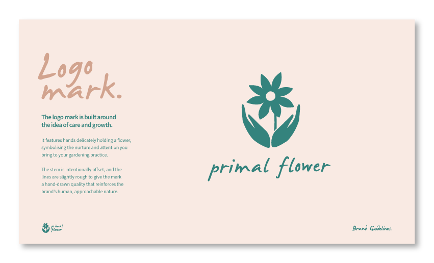
A mark that embraces imperfection
The final logo leans into a natural, slightly rough aesthetic. The offset stem and imperfect forms give it a hand-made quality that feels honest and grounded: exactly what Lollie wanted to communicate about her work.

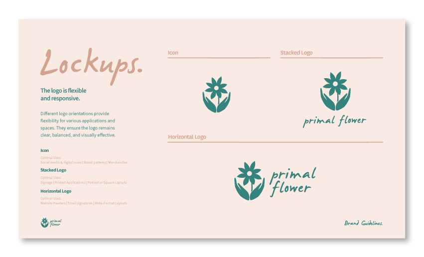
Mini Brand Guidelines
Keeping things consistent
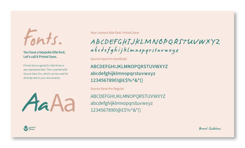
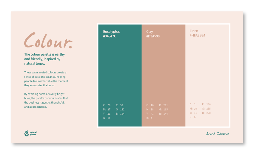
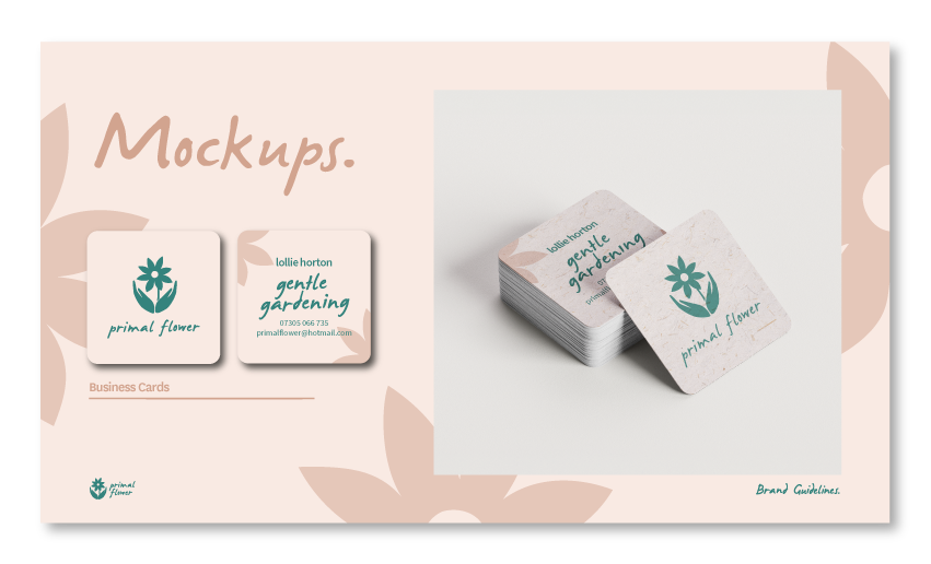
Alongside the logo, I created a short set of mini brand guidelines to help keep everything consistent as the business grows. These included colour usage, logo spacing, and a custom title font designed specifically for Primal Flower.
Lets connect!
If you have a project you’d like help with, or just want to say hi, I’d love to hear from you.